📝 Summary
This chapter focuses on the visual side of UI design. Inspired by the stylish look of Persona 5, I customized the numbers and underline effects in my app without using images. Despite font-loading errors and frustrating path mistakes, I kept refining until I achieved that distinctive "P5" flair using only code. This episode is filled with our dialogues—like when I asked, “Can we do this without using any images?”—so readers can feel like they’re building this together with us. It’s an entry that might make people think, “Wow, you can polish it to that level? I want to try too.”
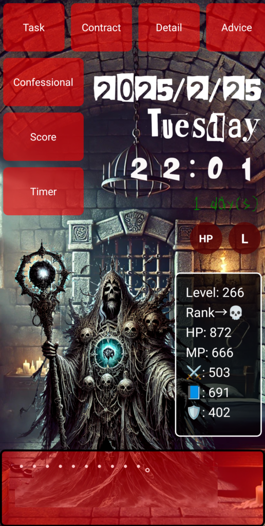
…But before we dive in, take a look at this—this is the app I spent 1,000 hours building from scratch. I started with zero knowledge, and I want to share with you how I got here!
"Coolness" Is a Kind of Justice
No matter how great the content is, a dull UI kills the vibe. I’ve felt this countless times while working on my app’s interface.
That's when Persona 5’s iconic UI popped into my head: bold reds, deep blacks, stylish slants—just oozing coolness. I decided to try replicating that look, starting with the numbers and section headers in my own app.
Starting with Cool-Looking Numbers
Me: “I want to make just the numbers look Persona 5-ish.”
You: “Then let’s apply a custom font. But if you get an error, it might be due to a wrong file path.”
That’s exactly what happened. I’ll never forget the deflation I felt when I realized my font path was wrong—it was ./fonts/p5hatty.ttf instead of ./fonts/p5hatty-1.ttf.
But once I fixed it and applied the font only to the numbers, adjusted their size, and added red and black shadows, the vibe started to feel just right.
Achieving the Look Without Using Images
Me: “I want the underlines to look like brushstrokes, Persona 5-style. Can we do that without images?”
You: “Totally. CSS is enough.”
So I used CSS ::after, combined with linear-gradient and skew, to create a wild, brush-painted underline effect.
Sample Code (Underline Effect)
{
  "class": "h3-underline",
  "css": {
    "position": "relative",
    "::after": {
      "content": "''",
      "position": "absolute",
      "bottom": "-10px",
      "left": "0",
      "width": "100%",
      "height": "8px",
      "background": "linear-gradient(to right, #ff0000 10%, black 30%, #ff0000 50%, black 70%, #ff0000 90%)",
      "border-radius": "3px",
      "transform": "skew(-10deg)",
      "z-index": "-1"
    }
  }
}
With this code, I drew an impactful line under section titles—just like the menu screens in Persona. I never imagined I could do this much without using images.
Visuals Can Trigger Motivation
When a “mere number” starts to look like an “in-game achievement,” your mindset shifts. Even things like "progress rate" or "false report count" feel meaningful when wrapped in a compelling aesthetic and narrative.
Conclusion: The Soul Is in the Details
This update wasn’t about functionality—it was about emotional comfort. And that alone can change a user's experience completely.
If you’re someone thinking, “Maybe I should try making something with AI too,” just remember:
Good design sparks affection. And that affection brings support.
●NEXT
AI App Development from Zero Knowledge – 1000 Hours #20
(👉#1)
●My HP
Check Out the Website I Built Using My 1000 Hours of App Development Experience!
It might look like a game, but actually—this is a website.
I spent 1,000 hours building the app, and then an additional 800 hours (as of May 2025, and I’m still updating it).
It was incredibly tough, but thanks to that, I’ve learned how to do so many things.
I’ll keep updating and improving it, so I’d really appreciate your support!
👇 This is who I am—and how I got here. 👇
The Story of a Japanese Former Teacher Who Didn’t Know Himself—Until He Spent 1,800 Hours Creating a Website to Find Out
👇Here’s how to make your WordPress site multilingual👇
[For Complete Beginners] The Fastest Way to Make WordPress Multilingual for Free


コメント