
Summary
This time, I tackled the challenge of "font design." I wanted to bring out a specific atmosphere by using calligraphy-style or horror-style fonts, but things didn’t go as smoothly as I hoped. I learned that applying fonts involves more than just specifying them—it’s surprisingly complex, involving Japanese language support, CSS specificity, and proper loading procedures.
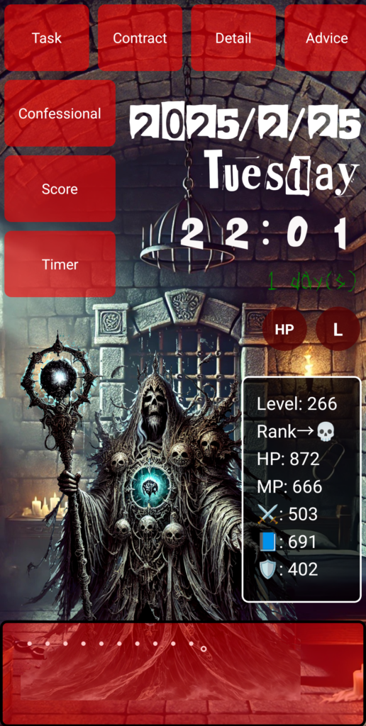
…But before we dive in, take a look at this—this is the app I spent 1,000 hours building from scratch. I started with zero knowledge, and I want to share with you how I got here!
Once the app's basic features were in place, I suddenly felt, "This looks too plain." I wanted the visuals to better reflect the content’s mood, so I decided to start with changing the fonts.
The first thing I tried was a "ransom note style." By randomly changing the background color, size, and rotation of each character, I aimed for a shady, suspicious effect. This part worked relatively well and made a strong visual impact.
However, that style only applied to the top of the screen. The rest of the app still used standard Gothic-style fonts, which started to bother me.
So I thought, “What if I unify the entire text with a brush script font?” I downloaded several Japanese calligraphy-style fonts (like Aoyagi Sosho and Setofont) and gave them a try.
...But nothing changed.
Why? The CSS looked fine, and I had defined the fonts with @font-face.
There were no display issues, and yet the font itself wouldn’t change.
So I checked with the developer tools (F12), and that’s when I discovered the fonts weren’t being loaded correctly—or they were being overridden due to CSS specificity.
Also, when I tried using English-only fonts (like Creepster), the Japanese text wouldn’t change appearance at all—a hidden trap I hadn’t considered.
From there, I went through trial and error: tweaking CSS selectors, checking file paths, clearing browser cache, and constantly inspecting through the dev tools.
Eventually, I realized that to actually change how fonts look, you need to meet all of these conditions:
- The font must support Japanese characters
- CSS specificity must be correctly handled (beware of class conflicts)
- The path defined in
@font-facemust be accurate - The browser must successfully load the font (you’ll see errors in F12 if it fails)
Only when all of these are properly set does the font appearance truly change. This basic principle hit me hard.
Conclusion: Fonts are deeper than they look
- Fonts won’t change just by specifying them
- Especially for Japanese, you must check compatibility and load success
- Changing the appearance of text drastically alters the app’s impression
- But behind that visual appeal lies a lot of boring trial and error
By focusing not only on "functionality" but also on "visual presentation," the impression you leave on users can shift dramatically. This font experiment, though full of frustrations, turned out to be a crucial step in making the app more engaging.
●NEXT
AI App Development from Zero Knowledge – 1000 Hours #6
(👉#1)
●My HP
Check Out the Website I Built Using My 1000 Hours of App Development Experience!
It may look like a game, but it’s actually a website I built after 1,800 hours of development. It was tough, but I gained the skills to build anything.
This site is designed to help people around the world pursue their dreams—using Japanese-style diligence and five key pillars: learning, exercise, sleep, nutrition, and time. I’m living this lifestyle too.
One day, I hope to team up with users who reach their dreams here and take on world-changing projects together.
So—want to chase a big dream with me?
👇 This is who I am—and how I got here. 👇
The Story of a Japanese Former Teacher Who Didn’t Know Himself—Until He Spent 1,800 Hours Creating a Website to Find Out
👇Here’s how to make your WordPress site multilingual👇
[For Complete Beginners] The Fastest Way to Make WordPress Multilingual for Free


コメント