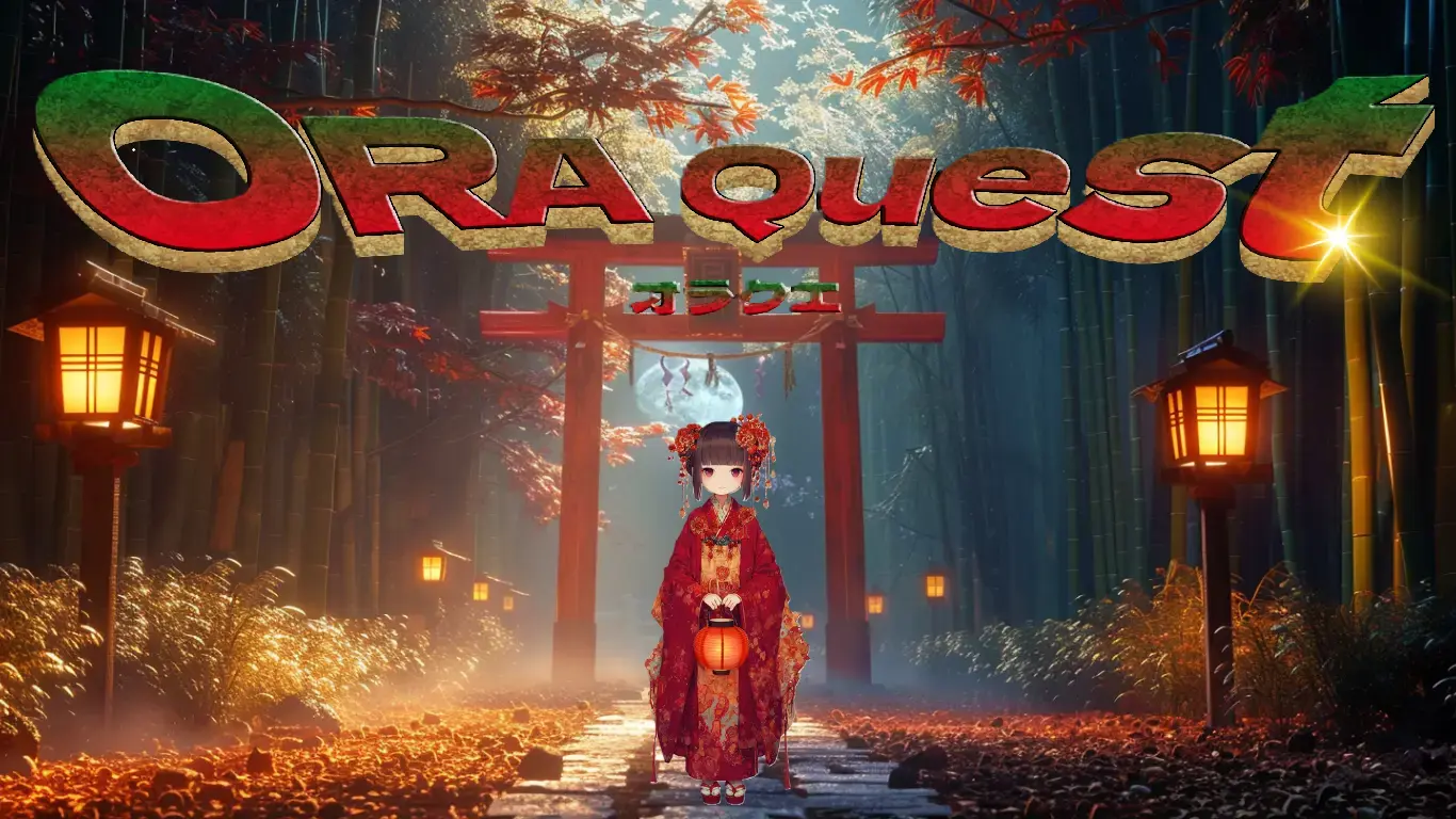
Quick Summary
This chapter focuses on designing a "level-up animation" for an app that upgrades the user’s level daily. While initially aiming for a Persona 5-style flashy animation, the effect felt overdone and disrupted the user experience. Through trial and error, the design settled on a subtle red-and-black gradient frame and flowing lines—leaving a lasting impression without being overwhelming. The key lesson: great UI is often about subtraction, not addition.
…But before we dive in, take a look at this—this is the app I spent 1,000 hours building from scratch. I started with zero knowledge, and I want to share with you how I got here!
Leveling Up, Subtly but Effectively
This time, the topic is level-up animations.
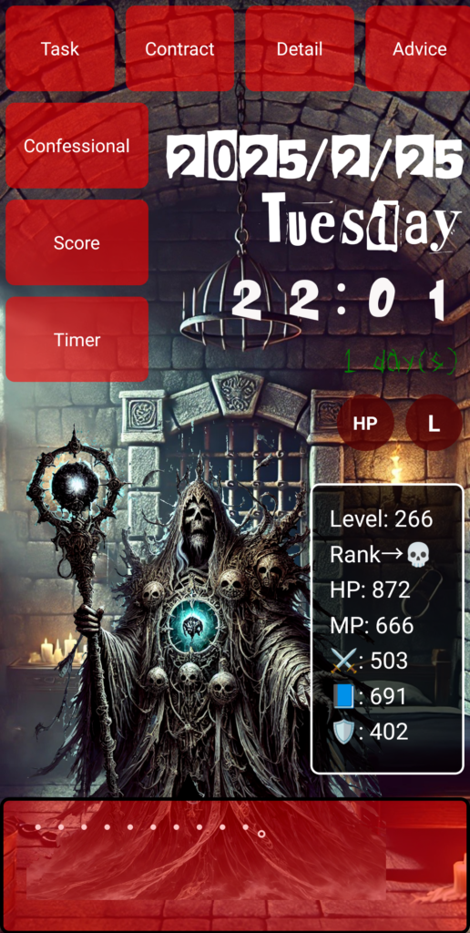
In this app, the user’s level increases every day. Naturally, I needed a visual effect to communicate that progress. But that’s where the challenge began—how do you express it?
At first, I went bold. I tried to mimic the stylish animations of Persona 5.
Picture iron bars slamming open left and right—a dramatic reveal. I recreated this vibe using CSS animations, complete with grid-like patterns.
But honestly? It looked tacky.
It felt way too heavy for something shown daily. The animation seemed long, and to make matters worse, bugs appeared—status boxes briefly disappearing, mysterious frames flashing on the screen edge. Clearly, this was too much.
That’s when I had a realization:
Maybe it’s better to convey the level-up not through a dramatic “effect,” but through a subtle “mood.”
The Power of Simplicity
Next, I tried something minimal:
A red-and-black gradient border that flashes briefly.
I added a temporary level-up class to the .status-box, then used CSS to make the border glow subtly. With setTimeout(), the class is removed after 1 second—creating a quick, natural animation that feels smooth each day.
To give it a bit more character, I added another touch:
A thin, elongated red-black line that flows upward. It’s not flashy, but it draws the eye. Even I thought, “This works.”
Plenty of Bugs, Plenty of Lessons
That said, the journey wasn’t bug-free.
Errors like "levelUp is not defined" and "setShowDoor is undefined" came up repeatedly. I kept running into basic state management issues in React. The most laughable? A JSX syntax error that actually displayed “gills” (in Japanese, “エラ” = “error”).
Less Is More in UI
After all this, one thing became clear:
UI strength doesn’t come from adding more—it comes from removing what’s unnecessary.
Persona 5’s design isn’t built on flashy animations alone.
Its world is crafted through consistency—color scheme, layout, spacing, rhythm in sound and motion. That’s what I’m aiming for too: immersion without awkwardness.
From now on, I’ll keep chasing those low-key but impactful animations that make users think, “Nice touch.”
●NEXT
AI App Development from Zero Knowledge – 1000 Hours #10
(👉#1)
●My HP
Check Out the Website I Built Using My 1000 Hours of App Development Experience!
It may look like a game, but it’s actually a website I built after 1,800 hours of development. It was tough, but I gained the skills to build anything.
This site is designed to help people around the world pursue their dreams—using Japanese-style diligence and five key pillars: learning, exercise, sleep, nutrition, and time. I’m living this lifestyle too.
One day, I hope to team up with users who reach their dreams here and take on world-changing projects together.
So—want to chase a big dream with me?
👇 This is who I am—and how I got here. 👇
The Story of a Japanese Former Teacher Who Didn’t Know Himself—Until He Spent 1,800 Hours Creating a Website to Find Out
👇Here’s how to make your WordPress site multilingual👇
[For Complete Beginners] The Fastest Way to Make WordPress Multilingual for Free


コメント