Quick Summary
This time, the theme is "UI tricks for elements you want to show but not obstruct." I share the journey of implementing a system where timers, prison labor tasks, and checklists are displayed compactly, then expand with a click. From failed attempts to the eventual success, this article also highlights my conversations with AI that helped refine the idea.
…But before we dive in, take a look at this—this is the app I spent 1,000 hours building from scratch. I started with zero knowledge, and I want to share with you how I got here!
Want to Show It, but Not Get in the Way
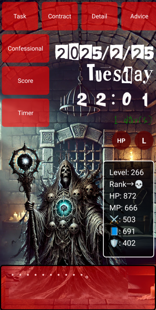
When building an app, there are always UI elements that you want visible at all times—but you don't want them cluttering the screen. This time, the focus was on the “Timer” and “Prison Labor + Checklist.” You want them constantly on screen, but too big and they become a nuisance. Hide them entirely, and users won't notice them.
That’s when the idea hit me: “Can I make them small by default, and expandable when needed?”
First Attempt: Stuck in Dual-Screen Hell
My first try involved placing the list in a sidebar, which would show a panel on the right when clicked. But when I asked ChatGPT for help, it kept trying to divide the screen into two parts.
Me: “Can we go back to the original single-screen setup? No splitting.”
ChatGPT: “Understood. I’ll limit it to one screen and switch to popups.”
But when I tested it, it still felt like it was jumping to another screen—something didn’t sit right.
Me: “Instead of a sidebar, I want clicking a link on the screen itself to trigger the popup right there.”
That’s when the concept finally clicked—and we began heading in the right direction.
Implementation Begins: A Simple Small-to-Large Mechanism
The approach was simple:
- Initially display small versions of the “Timer” and “Prison Labor + Checklist” somewhere on the screen.
- When clicked, they pop up larger.
- Include a “Close” button in the popup.
Here’s the part of the code handling state management:
{
  "popupContent": null,
  "openPopup": "setPopupContent('timer' or 'taskManager')",
  "closePopup": "setPopupContent(null)"
}
In React, this is managed using useState. When popupContent is null, nothing is shown. When it's 'timer' or 'taskManager', the respective component appears as a popup.
Visual Design Matters Too
Technically, this wasn’t too hard—but how it looks really matters. The compact display shouldn’t be too flashy but should still invite clicks. I styled them like mini cards using CSS, and darkened the background of the popup slightly to help users focus.
Just "How It's Displayed" Can Change Everything
The big takeaway? How you display things can impact UX way more than what you display. I didn’t change the content—but just by changing the presentation, the whole app felt more polished.
And above all, what made me happiest was that—with some help from AI—I managed to turn my own idea into a reality.
Today's Haiku (English)
A tiny window—
Click, and the world expands wide.
Small thoughts bloom to life.
●NEXT
AI App Development from Zero Knowledge – 1000 Hours #24
(👉#1)
●My HP
Check Out the Website I Built Using My 1000 Hours of App Development Experience!
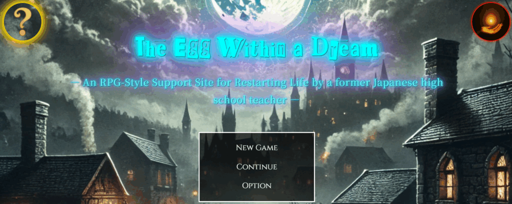
It might look like a game, but actually—this is a website.
I spent 1,000 hours building the app, and then an additional 800 hours (as of May 2025, and I’m still updating it).
It was incredibly tough, but thanks to that, I’ve learned how to do so many things.
I’ll keep updating and improving it, so I’d really appreciate your support!
👇 This is who I am—and how I got here. 👇
The Story of a Japanese Former Teacher Who Didn’t Know Himself—Until He Spent 1,800 Hours Creating a Website to Find Out
👇Here’s how to make your WordPress site multilingual👇
[For Complete Beginners] The Fastest Way to Make WordPress Multilingual for Free

コメント