Summary
This time, the spotlight is on a seemingly minor CSS issue: only the .timer-title font won’t change. Even with a solid grasp of HTML/CSS basics, identifying font issues specific to Japanese can be unexpectedly tricky. Through dialogue with ChatGPT, I uncovered the cause, and this article aims to inspire readers facing similar stumbling blocks to think, “Maybe I can do this too.”

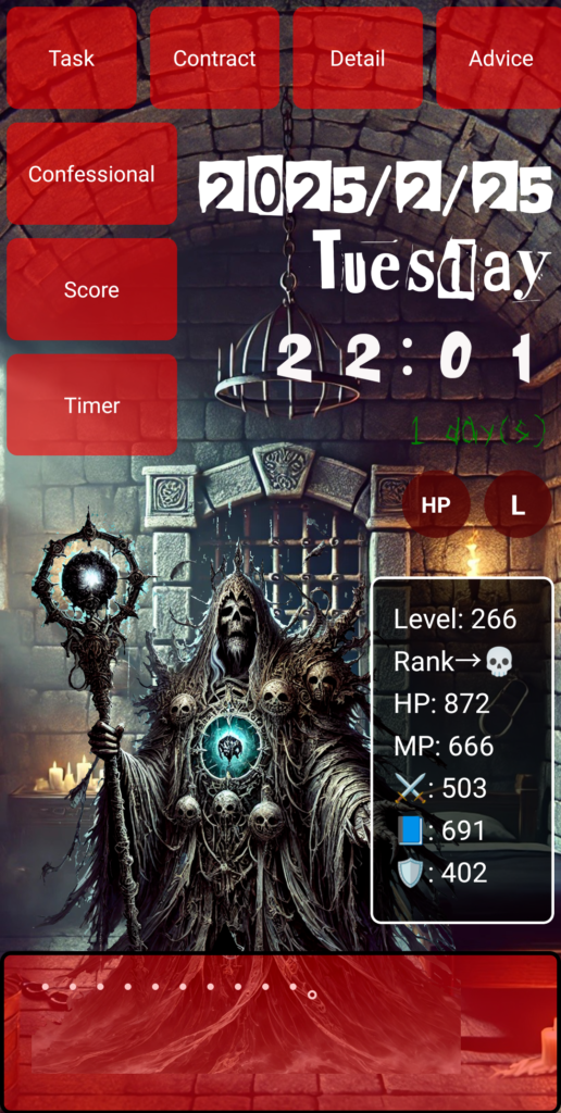
…But before we dive in, take a look at this—this is the app I spent 1,000 hours building from scratch. I started with zero knowledge, and I want to share with you how I got here!
Why won’t this one title change fonts?
“One part of my app just won’t switch fonts—only .timer-title stays unchanged.”
That’s what I asked during a chat while developing my app. The title text on the Timer screen stubbornly refused to adopt the specified font. Other elements like .timer-display reflected changes perfectly, so why not this one?
Of course, I tried several fixes on my own—switching the tag to <h2>, then <p>, adding !important, double-checking the class name, and verifying the CSS was loaded correctly.
“This is strange. There must be a reason…”
Calm advice from ChatGPT
ChatGPT responded coolly:
“First, use Chrome’s Developer Tools to check if the CSS is being correctly applied. You’ll see if the style is being overridden or invalidated.”
I did just that—opened DevTools and inspected the .timer-title. The styles were clearly applied. Nothing was being ignored or overwritten.
A surprising twist: “It works with English text!”
Then it hit me.
“When I changed the title from 'タイマー' to 'TIMER', the font did change!”
Wait… could that be it?
Yes. That was it.
The real issue: The font doesn’t support Japanese
The font I had specified—Expose-Regular.otf—was a Latin-only font with no support for Japanese characters. So even though the CSS was correct, it fell back to a default system font like Arial or sans-serif for Japanese.
The problem wasn’t the CSS—it was the font itself.
The fix: Use Japanese-supported fonts or specify a fallback
jsonコピーする編集する{
  "font-family": "'Expose', 'Noto Sans JP', sans-serif"
}
By explicitly stating a fallback, like Noto Sans JP, the CSS ensures that Japanese characters are rendered with a suitable font when Expose isn’t applicable.
Alternatively, just start with a font that supports Japanese. Google Fonts offers great options like M PLUS 1p or Noto Sans JP.
A small bug, a big lesson
This wasn’t really a CSS bug—it was a “font capability trap.” With ChatGPT’s help, I solved it, but left to my own devices, it might’ve taken far longer.
I wish I could tell my past self—who thought only tech-savvy people could build apps:
“You can just ask AI when you don’t know something. Keep at it. You’ll find the cause eventually.”
So yes, you can do this too
I knew nothing about programming when I started. Now I’m debugging CSS and improving my app. And someone out there is watching—cheering me on.
You, reading this now, can create something too. Even if things don’t “change” at first, persistence will eventually let you meet the version of yourself who can change them.
📝 Today’s Haiku in English
A stubborn font stands—
Till I ask why it won't move.
Then it speaks: "No JPN."
●NEXT
AI App Development from Zero Knowledge – 1000 Hours #22
(👉#1)
●My HP
Check Out the Website I Built Using My 1000 Hours of App Development Experience!

It might look like a game, but actually—this is a website.
I spent 1,000 hours building the app, and then an additional 800 hours (as of May 2025, and I’m still updating it).
It was incredibly tough, but thanks to that, I’ve learned how to do so many things.
I’ll keep updating and improving it, so I’d really appreciate your support!
👇 This is who I am—and how I got here. 👇
The Story of a Japanese Former Teacher Who Didn’t Know Himself—Until He Spent 1,800 Hours Creating a Website to Find Out
👇Here’s how to make your WordPress site multilingual👇
[For Complete Beginners] The Fastest Way to Make WordPress Multilingual for Free


コメント